Actionable findings
What the data revealed
01
Network tickets breach SLA at 37.5% — the highest of any category — despite having the fastest resolution time at 23hrs avg. The breach happens in the 1-hour first-response window. Fix: dedicate on-call coverage during Monday morning peak hours.
02
3 agents handle 35% of all tickets (973, 973, 928 vs team avg of 400). The scatter chart shows these same agents have the highest breach rates — confirming this is a workload distribution failure, not a skill gap.
03
SLA breach rate held flat at ~23% across 26 months with no improvement trend. This rules out random variation — it's a structural problem requiring a staffing or routing intervention, not monthly process tweaks.
04
Marketing generates 22.97 tickets per employee — highest burden ratio of any department. Despite having only 35 staff, they place more per-capita demand on IT than Engineering (120 staff). Targeted self-service training could reduce volume.
05
9.23% of resolved tickets were reopened (~737 tickets) — agents are closing tickets before the issue is fully resolved, then reopening when the employee reports it persists. The 95.34% FCR rate looks strong on its own, but the reopen rate points to a quality-assurance gap in the closure process itself.
Dashboard preview
3-page Power BI dashboard
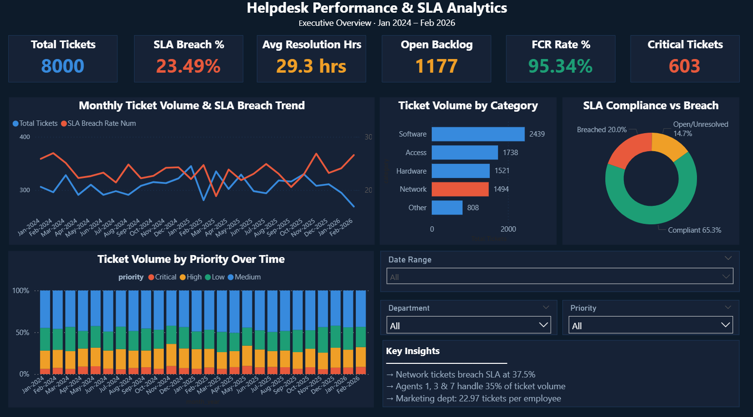
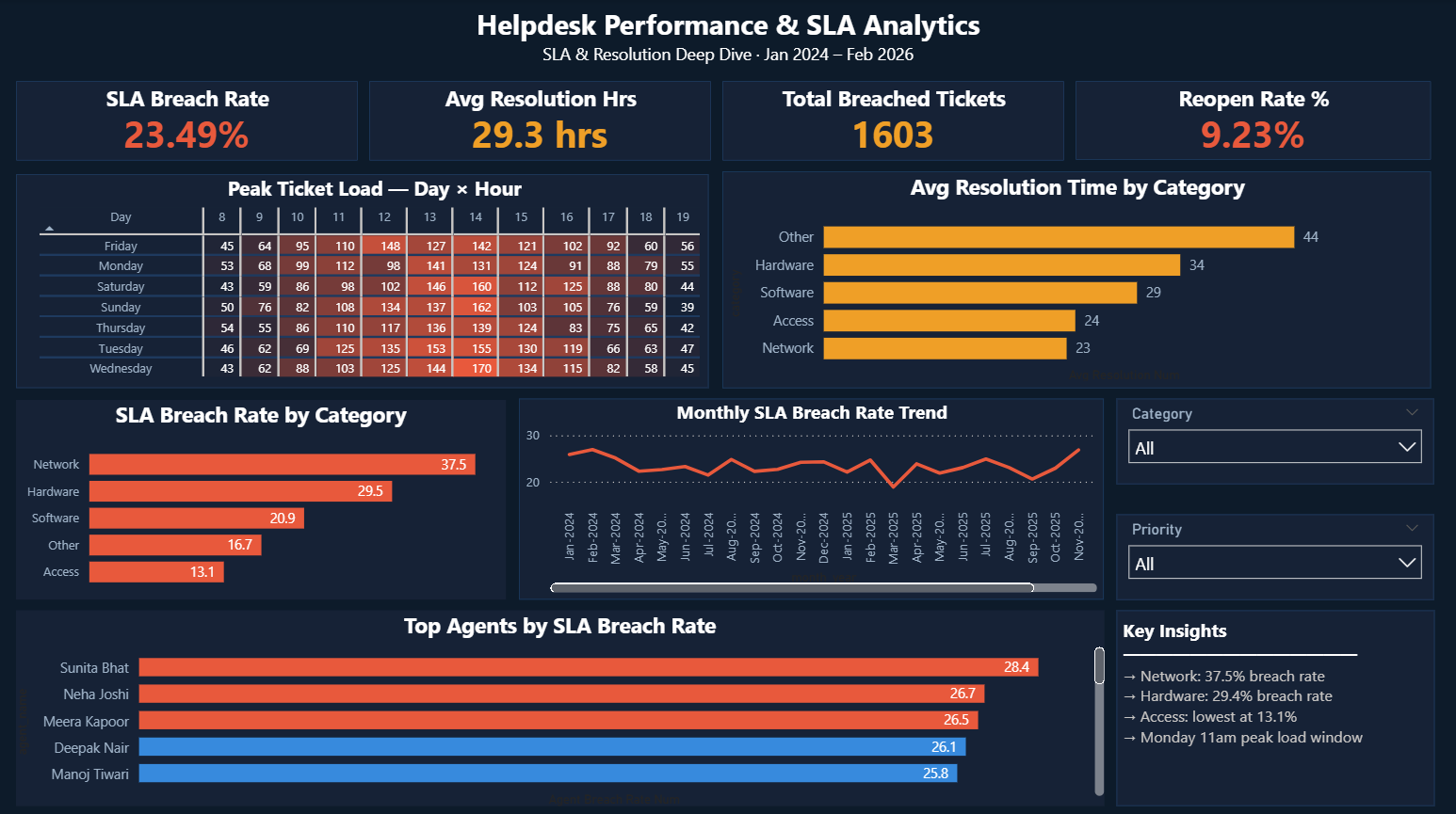
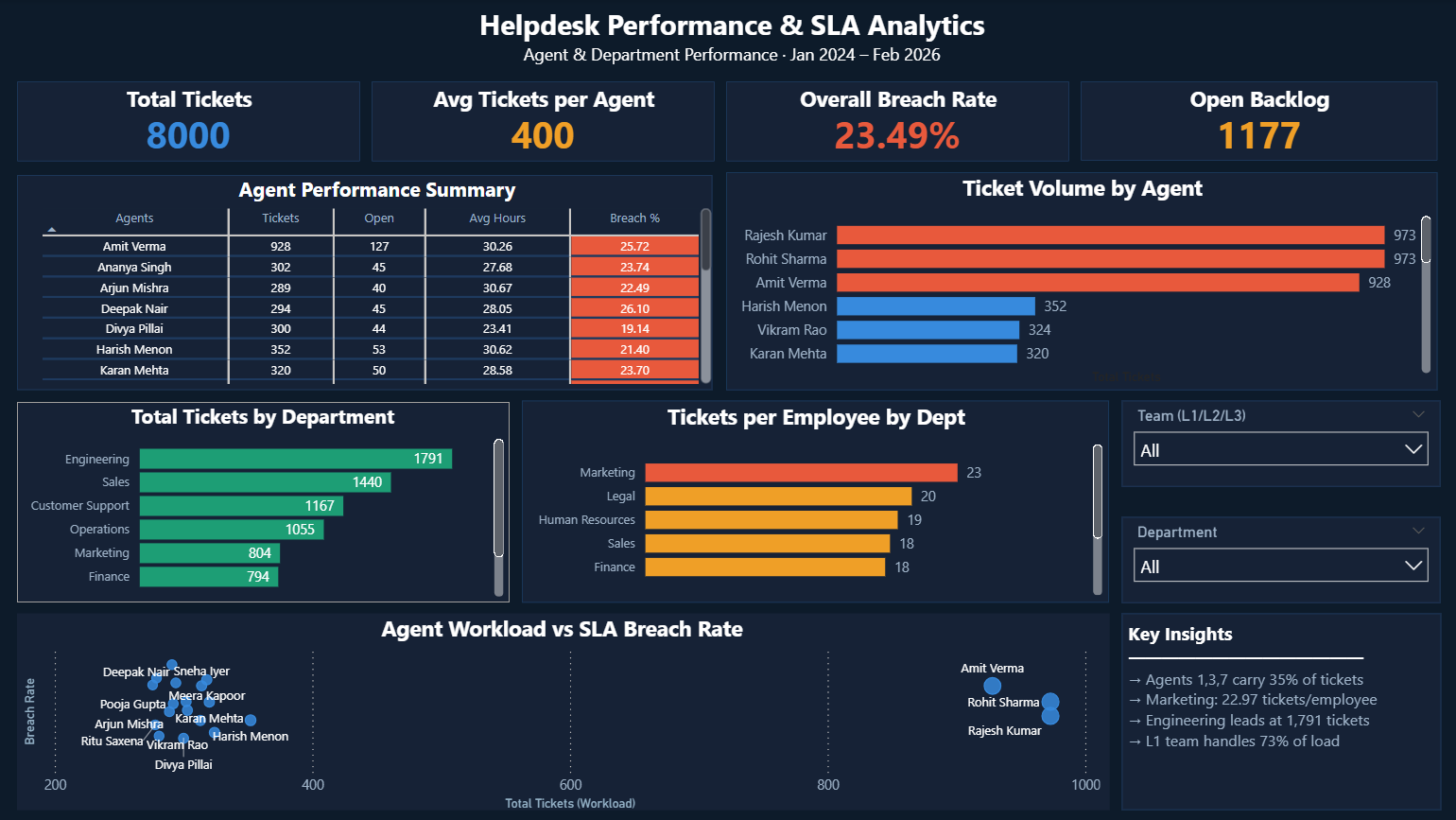
Click main image to enlarge · 3 pages
Technical highlights
How it was built
4-table normalised schema — FK, CHECK, and UNIQUE constraints enforced at database level, not in Power BI
SLA breach flag computed via a dual-column JOIN (category + priority) against sla_policy, using DATEDIFF(MINUTE) ÷ 60.0 for decimal-precision resolution_hours — avoids truncation errors and blanket-threshold mistakes on tight 1–2hr SLAs
RANK() OVER window function for agent workload rankings without collapsing rows like GROUP BY would
3 SQL views as Power BI data layer — all JOIN logic and derived column logic lives in SQL, not scattered across DAX
12+ DAX measures with separate text and numeric versions — Power BI chart axes reject text measures; KPI cards need formatted strings
Two visuals beyond standard bar/pie charts: a Day × Hour heatmap matrix with conditional formatting (Monday 11am–1pm identified as peak load), and an Agent Workload vs Breach Rate scatter chart that separates overload from skill issues