Actionable findings
What the data revealed
01
Energy leads AI disruption intensity at 23.62 out of 100 — the highest across all 8 industries — while also carrying a high automation risk of 46.9%. Absolute disruption remains below the midpoint, but the combination of top-ranked intensity and high risk makes Energy the highest-priority sector for immediate workforce intervention.
02
Technology has the lowest AI replacement score at 45.39 out of 100 — meaning nearly half of tech tasks remain at moderate automation risk despite the industry being AI-forward itself. Reskilling investment here yields workers who collaborate with AI tools, not workers who compete with them.
03
Global average salary increased by $3,492 after AI adoption ($86,533 → $90,025) — suggesting augmentation over pure displacement. The gain isn't even across sectors though: Transportation grew fastest at +0.43% while Education was the only industry to decline (−0.21%).
04
Average Skill Gap Index sits at 50 out of 100 — exactly at the midpoint across all 8 industries. This means the workforce is neither critically undertrained nor adequately prepared, but sitting in a vulnerable middle ground that requires proactive, broad intervention rather than sector-specific fixes.
05
70%+ of the workforce faces at least moderate automation risk (27.78% High + 42.65% Medium). At the role level, Teachers and Customer Support Representatives carry the highest Skill Gap Index and Reskilling Urgency scores — despite not being the highest automation-risk roles — making them the clearest priority candidates for programme investment.
Dashboard preview
4-page Power BI dashboard
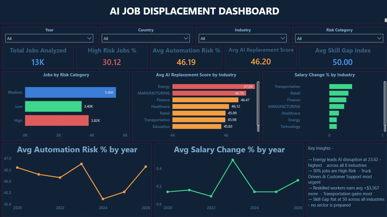
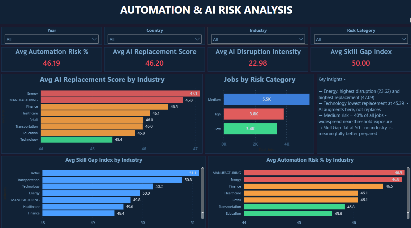
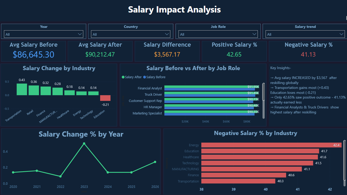
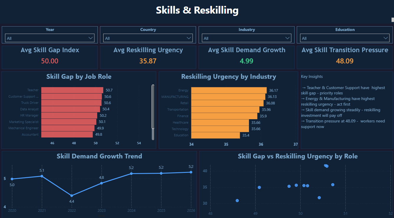
Click main image to enlarge · 4 pages
Technical highlights
How it was built
6 categories of data quality issues resolved: NULLs, duplicates, inconsistent casing, salary outliers, invalid category variants, and year string corruption (letter-O substituted for zero)
ROW_NUMBER() window function for deduplication — PARTITION BY job_id preserves the first occurrence while removing all duplicate rows
CASE statement normalising 6 corrupt risk category variants (MED, hIGH, Lowww, HIGH!) to clean High / Medium / Low values
salary_trend derived column from salary_change_percent thresholds — Positive (>2%), Negative (<−2%), Stable — used as a slicer dimension across all 4 pages
Multi-stage pipeline: Python data quality engineering → SQL Server cleaning and modelling → Power Query final type corrections
12+ DAX measures covering automation risk, AI replacement score, salary delta, reskilling urgency, and skill gap index
Skill Gap vs Reskilling Urgency scatter chart — two-dimensional view that identifies where high gap AND high urgency intersect for prioritising programme investment